

HCMC has 738 coffee shops.
Parking at most of them is a gamble.
Ho Chi Minh City has the most coffee chains in Vietnam. People visit cafés to work, meet, and socialise. But scarce parking makes it hard to visit, hurting business.
This was a self-initiated project. I didn’t receive a brief and I found the problem by doing what any good researcher does: I looked for patterns in publicly available feedback, and I found them everywhere.
The core insight: the problem wasn’t the absence of parking. It was the absence of certainty. Customers were making a different decision the next time and choosing a competitor with easier access, not because the coffee was better.
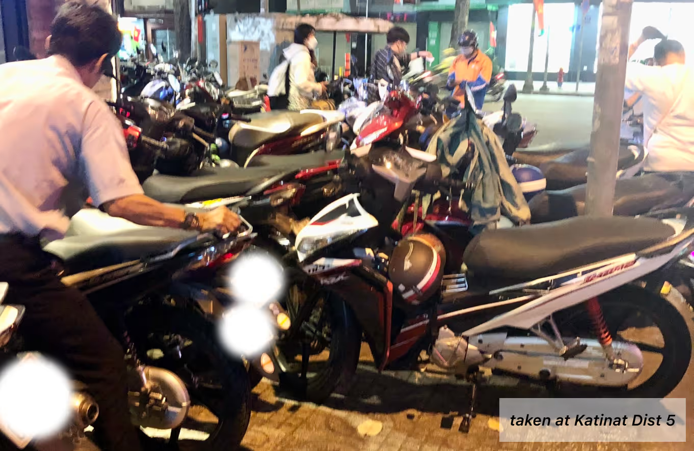
What the research showed
I analysed Google Maps reviews for Cheese Coffee, The Coffee House, Starbucks, and Highlands Coffee across HCMC. Parking complaints were consistent and the volume was increasing with the city’s growing café density.
Empathy mapping of reviews revealed the emotional pattern: users weren’t angry about HCMC traffic. They were frustrated by wasted time cause of travelling 30 minutes to a location only to discover no parking and having to leave immediately.
After mapping every negative review, 4 types emerged and not by demographics, but by behaviour: the regular, the professional, the family visitor, and the user with accessibility needs. Each drives a distinct set of product requirements.
A competitive audit of parking apps, map apps, and coffee chain apps in Vietnam showed that none addressed the specific problem of real-time parking availability at the venue level. The gap was clear.
4 user types, 1 product
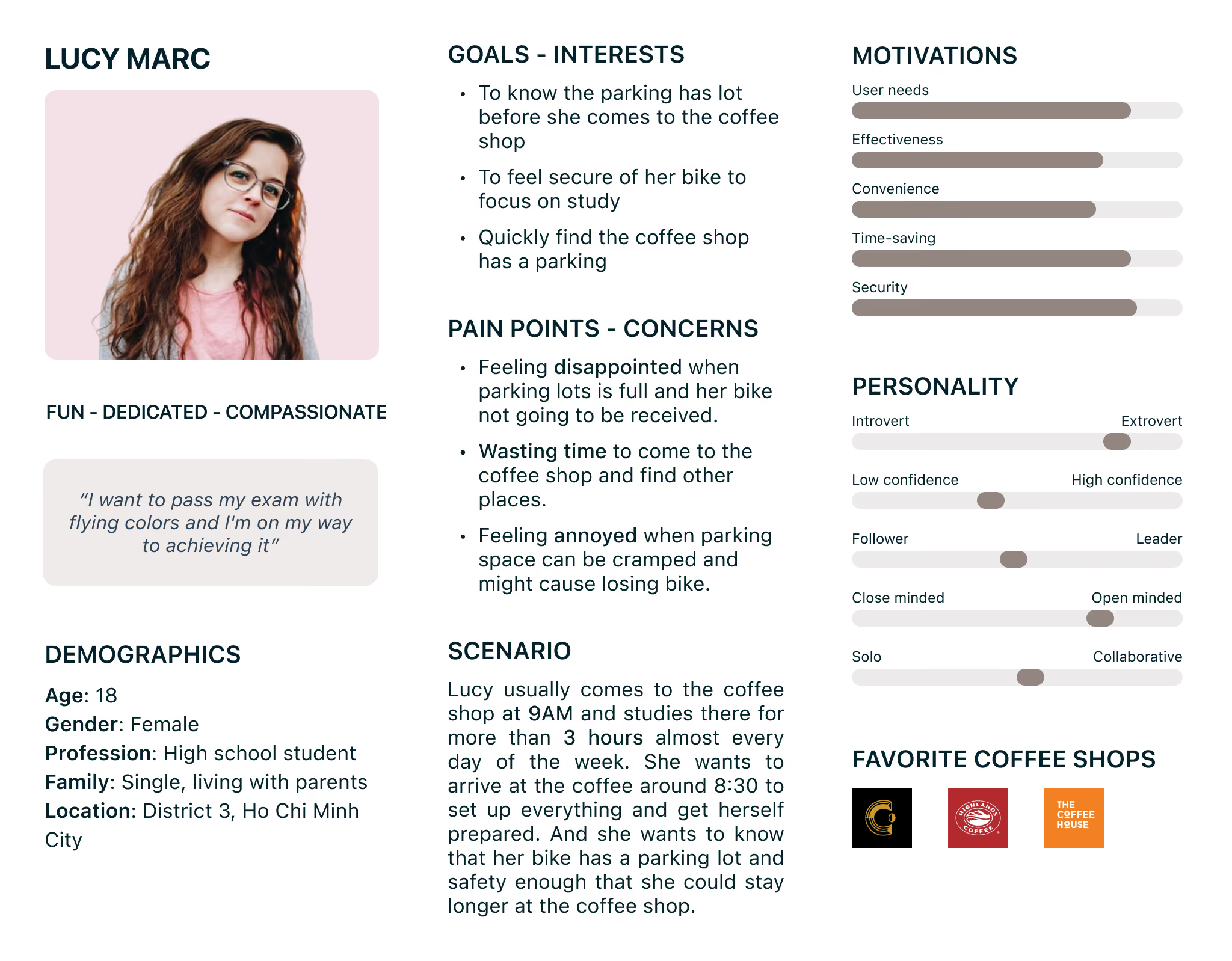
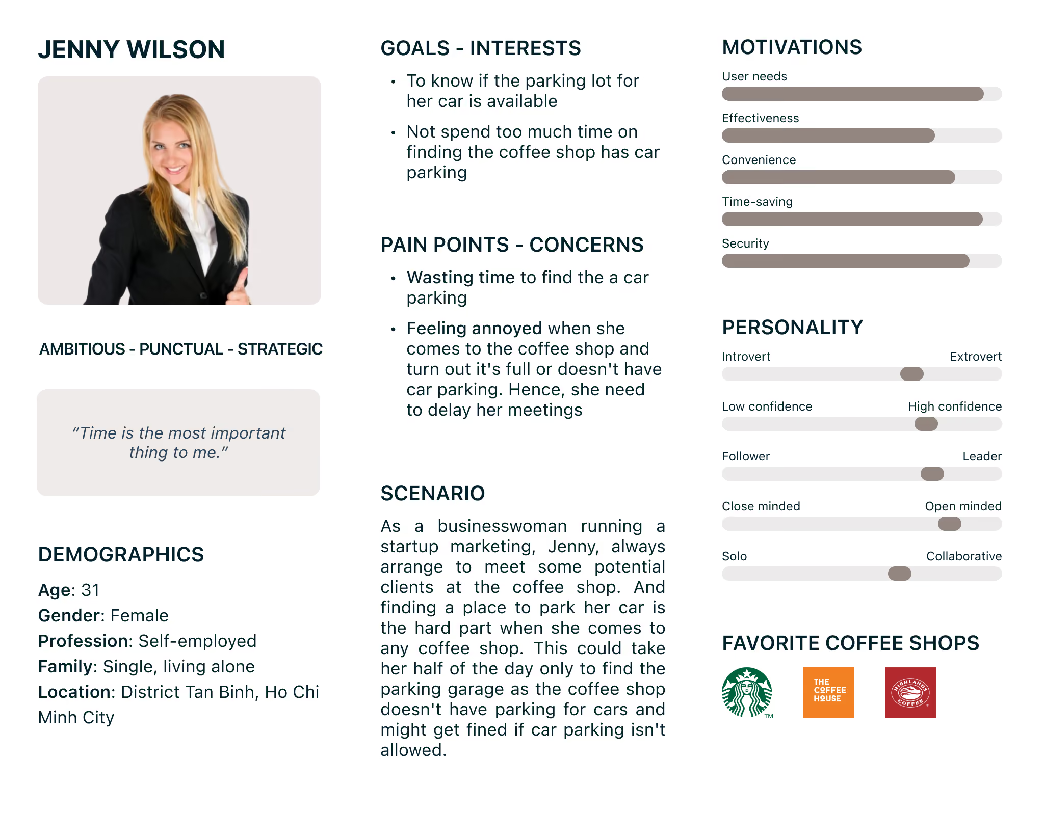
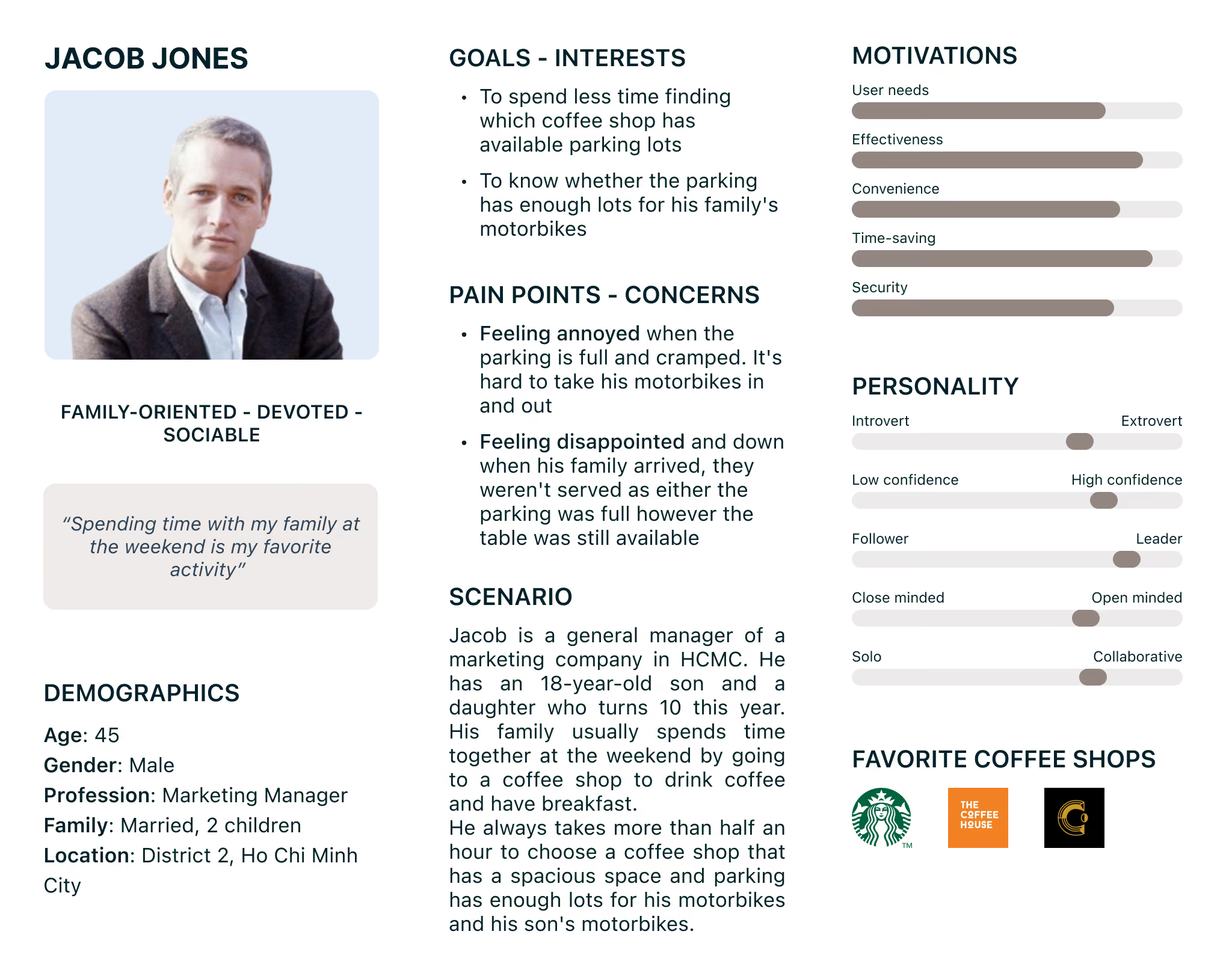
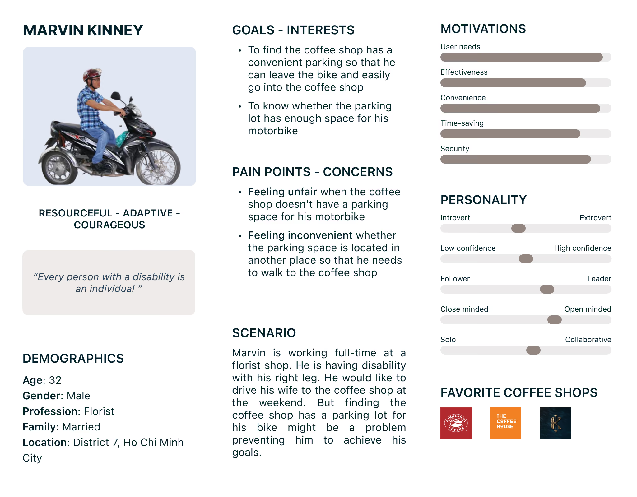
After field research at multiple Cheese Coffee locations by talking to staff, watching how customers moved, reading every App Store review and the real insight emerged. The six failures weren’t the problem. They were symptoms.
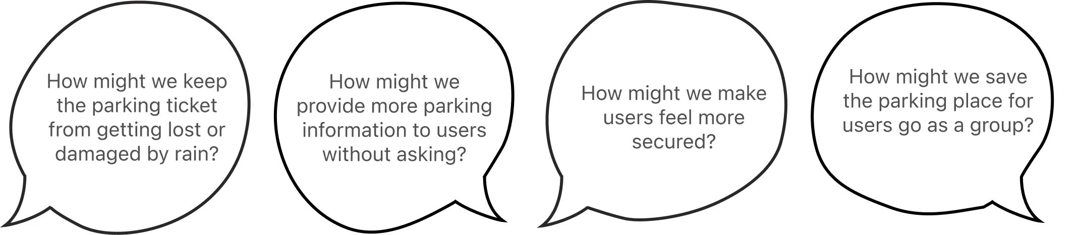
End-to-end ownership
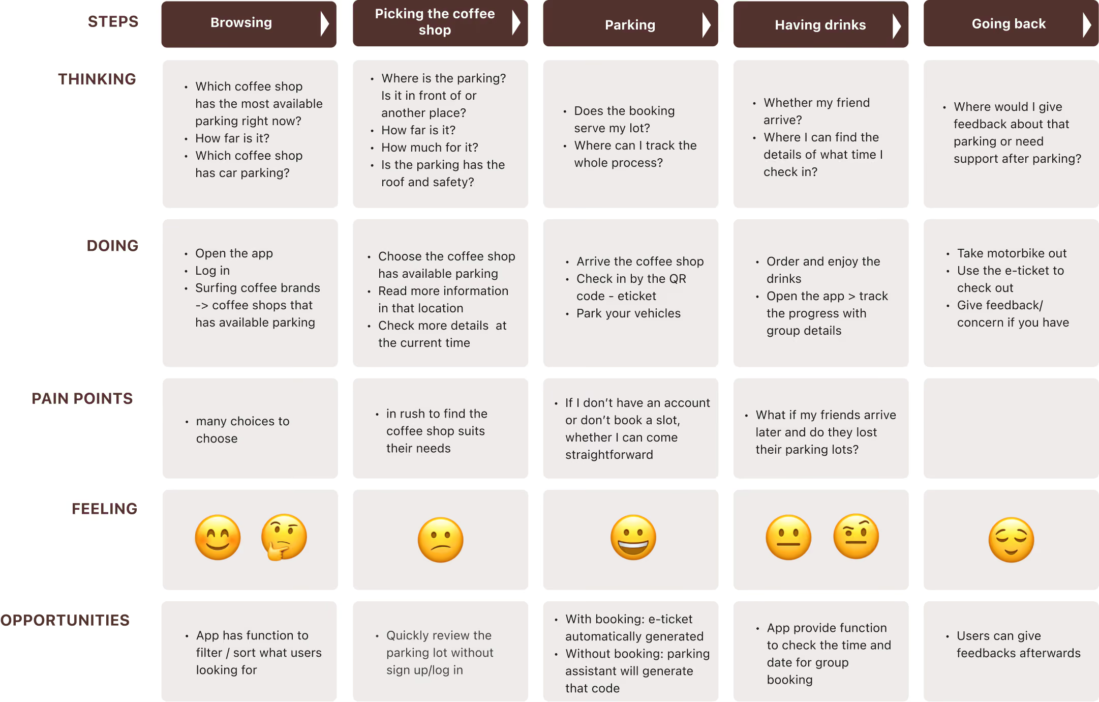
Review analysis · Empathy mapping · Persona development · Journey mapping · Competitive analysis · HMW framing
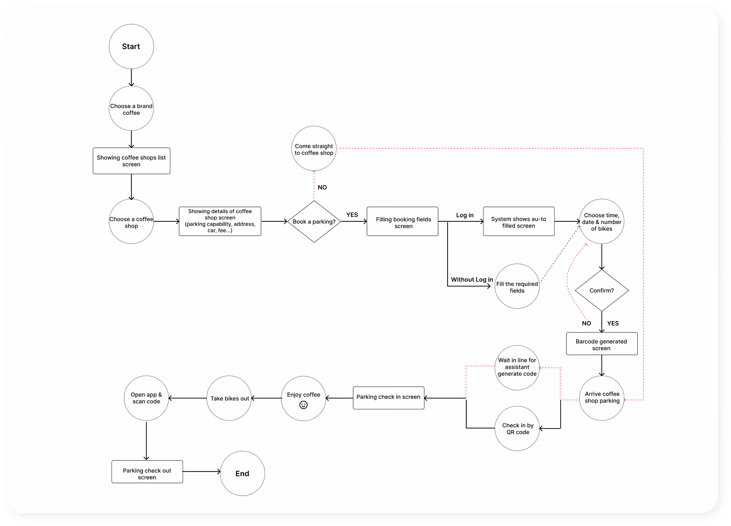
Brand identity · Logo · Colour system · User flows · Wireframing · Hi-fi UI · Bilingual prototype (EN/VI)
Usability testing (10 participants in-person) · Task analysis · 3 design iterations based on findings · Success metrics
Why bilingual was a first-class decision, not an afterthought. HCMC has a significant expat and tourist community who regularly use these café chains. Designing for Vietnamese only would mean ignoring a meaningful portion of the target market.
Why I recruited at coffee shops. Lab testing missed half the context. Coffee shop participants were near actual use, having just experienced or about to experience parking searches. This closeness made feedback more accurate and honest.
5 features, 5 personas,
3 usability failures fixed.
Every design decision was driven by a user need or a validated test finding. Here are the full process:
User journey map
User Flow
What usability testing changed
10 participants. In-person. At coffee shops. Each received a small thank-you gift. Tasks covered finding a location, checking availability, booking a spot, and using the e-ticket. Strong concept validation and three specific friction points that mattered enough to iterate on before finalising.
Renamed to "Browse without signing in", repositioned as a clear secondary action below the primary CTA. Resolved immediately in re-test.
Replaced with an explicit colour-coded slot counter — "8 available" (green), "2 available" (amber), "Full" (red). Removed the sort function and no participant had touched it.
Redesigned with an explicit text label alongside the icon: "Accessible parking". Icon alone was insufficient; language was necessary to prevent misinterpretation for a safety-critical feature.
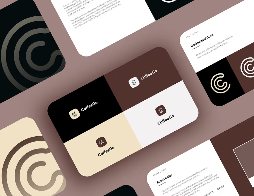
Brand: built for coffee culture, not a car park
Parking apps use greys and greens. I chose espresso brown, warm and coffee-related, distinct in the category. The brand feels like a café, not a car park.
From paper to full prototype
From observation to
validated prototype
10
in-person usability participants are recruited at coffee shops, matched to all 4 personas
3
meaningful UX iterations shipped after testing, all improving task clarity or accessibility
90%
task completion rate on core booking flow
Value created — for customers and for businesses
- → Plan visits in advance with confidence, no more uncertainty-driven decisions
- → Accessible parking is visible and bookable, the first product to surface this information
- → Group and family bookings are multiple spots in one transaction
- → E-ticket replaces paper, frictionless handoff at the barrier
- ↗Reduce lost visits from parking uncertainty that protects revenue at competitive locations
- ↗Turn parking into a brand experience differentiator, not just a logistics problem
- ↗Data on visit intent and parking demand could be actionable for location planning
- ↗Fewer negative Google Maps reviews about parking, protecting brand perception
Ho Chi Minh City has the most coffee chains in Vietnam. People visit cafés to work, meet, and socialise. But scarce parking makes it hard to visit, hurting business.
I'd run a second test with 20 participants, over-recruiting users from the accessibility persona I under-represented. The accessibility flow needed more iteration due to limited feedback from users who depend on it.


