A brand Gen Z loves.
An app they ignore.
Cheese Coffee is a European-style coffee chain built for Gen Z with vibrant locations, strong social presence, real loyalty. I was a regular here. And when I downloaded the app, I couldn't believe what I found.
A 1-star rating. Under 500 downloads. No reviews. And from user feedback I collected. That is a clear retention issue.
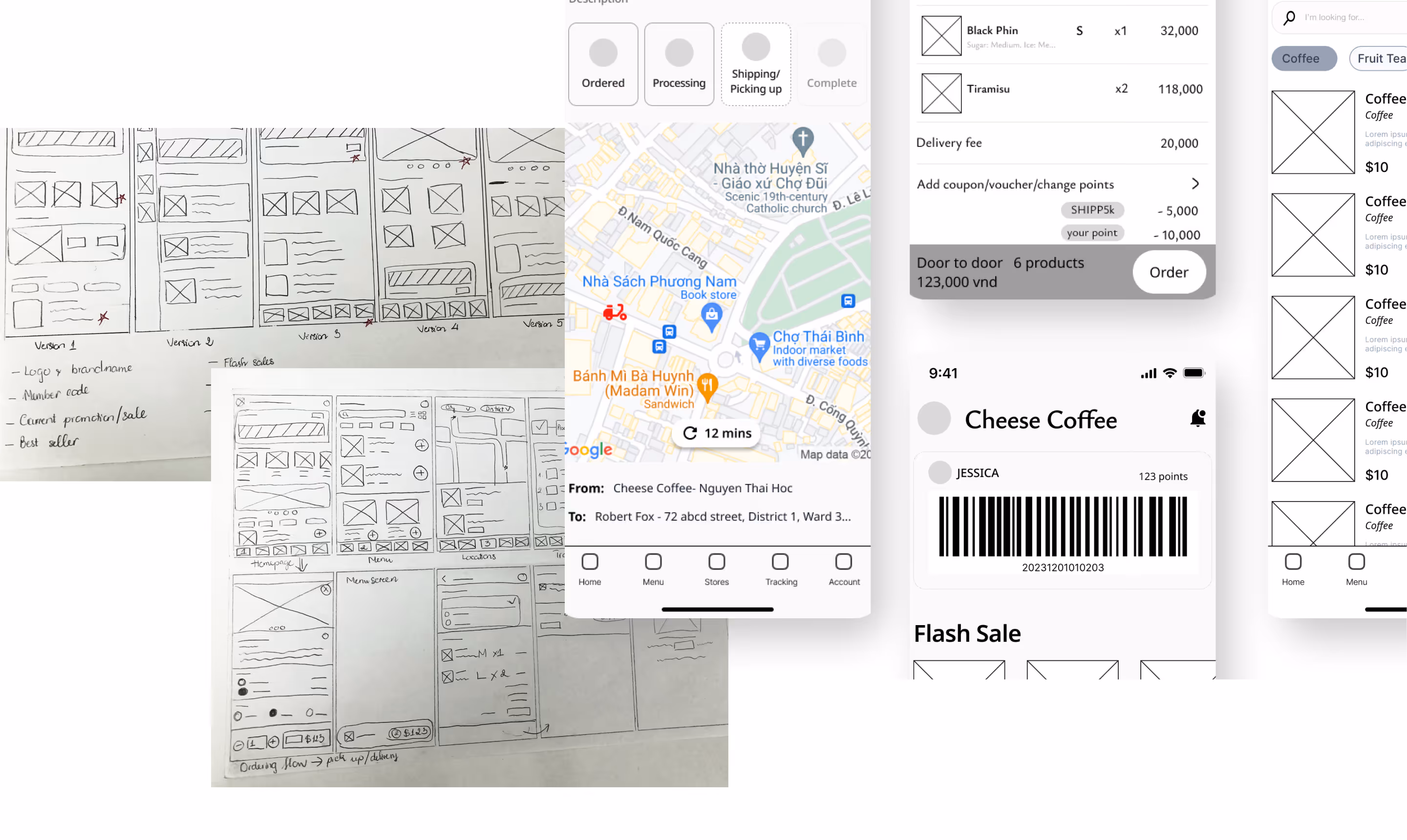
I ran an independent UX audit and identified six distinct failures and each one a different type of pain.
Booking? Loyalty? Browsing? Users couldn’t tell and confusion at launch is a one-way door to uninstall.
High drop-off rate; no retained users; app abandoned after first session
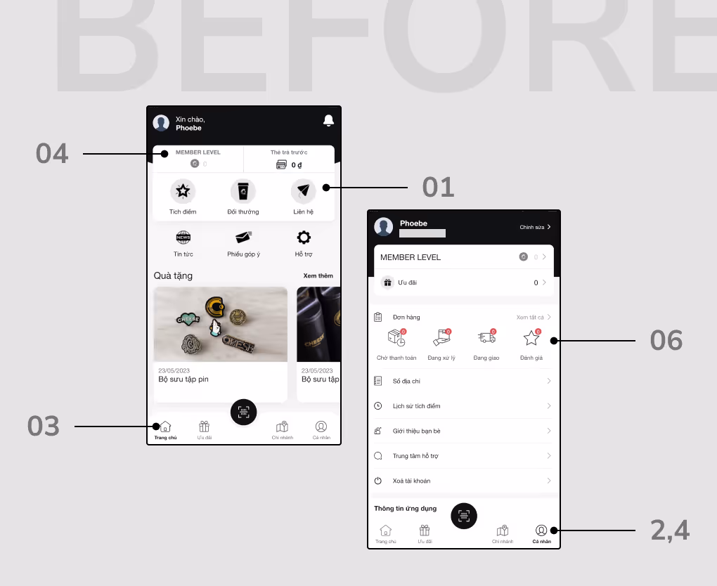
Required navigating 3+ levels to access. Most users gave up before they got there.
Loyalty programme effectively unusable; zero point redemption in stores
Mixed outline and filled icon styles at incorrect sizes. A small detail but it signals “unfinished” to every user.
Subconscious distrust; app reads as unfinished or unreliable
Arbitrary font sizes with no system and visual clutter breaking the information hierarchy on every screen.
Cluttered appearance; users struggle to identify primary actions
The app felt generic and no trace of Cheese Coffee’s visual identity, tone, or energy. It could have been anyone’s app.
Brand trust not transferred from physical to digital; no emotional connection
The interface looked untrustworthy — reducing every conversion metric and making in-app purchasing feel risky.
Low conversion on any CTA; no path to ordering, visiting, or earning points
What I owned,
start to finish.
This was a self-initiated project. No client brief, no manager, no team. Every stage is from identifying the opportunity to delivering the design system, was my responsibility.
UX audit · Field research · Competitive analysis · App Store mapping
Wireframing · UI design · Interaction design · Brand alignment · Prototype
Atomic Design System · Component library · Icon redesign · Typography system
A brief given by a client defines what to build. A problem discovered independently defines whether it's worth building. I found this through observation, not an assignment, which meant every decision was made from first principles, not from a pre-written specification.
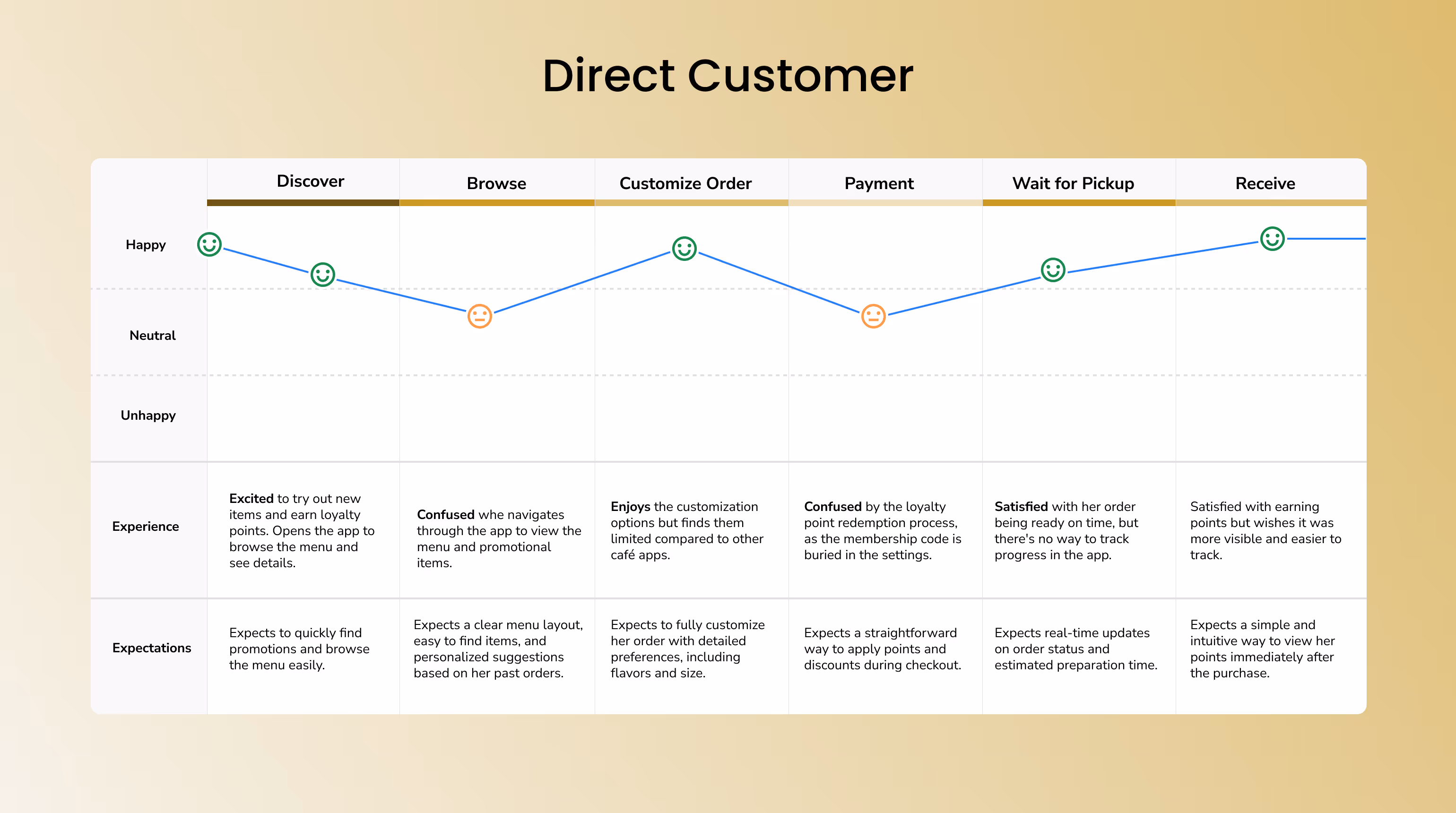
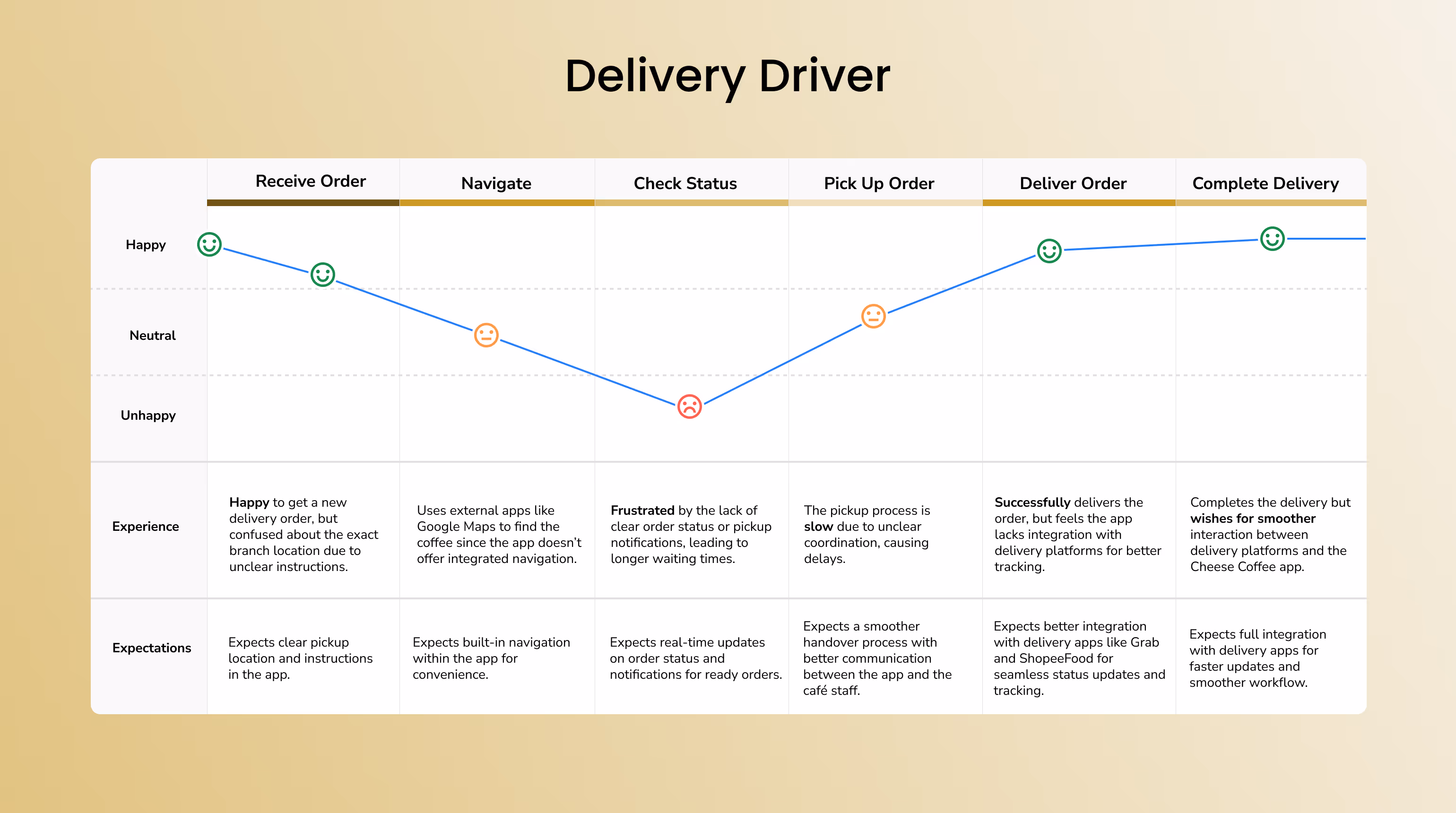
Two user groups.Field research revealed two distinct users with opposite needs: the direct customer (café regular who wants loyalty instantly) and the indirect customer (Grab/ShopeeFood delivery partner who needs order tracking). A successful redesign had to serve both without making either feel like an afterthought.
Every decision
had a reason.
Not aesthetic choices. Each one is a direct response to a validated problem, connected to its intended impact.
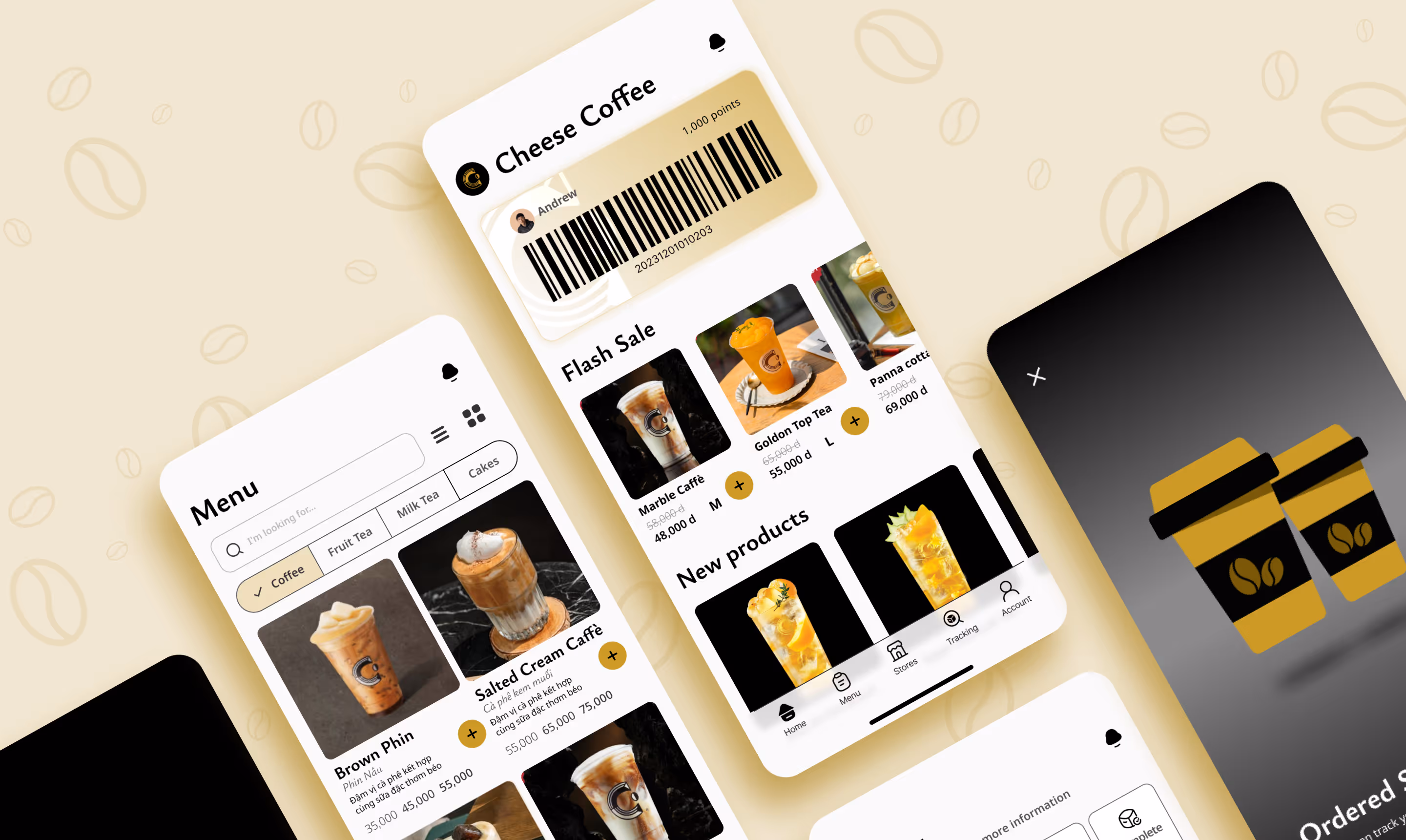
Design System — built to scale, not just to ship
I applied Atomic Design throughout. Cheese Coffee will keep building features, every component needed to be reusable, documented, and coherent at scale. The system covers colour tokens, typography, spacing, iconography, and interactive states; all grounded in Cheese Coffee's brand identity.
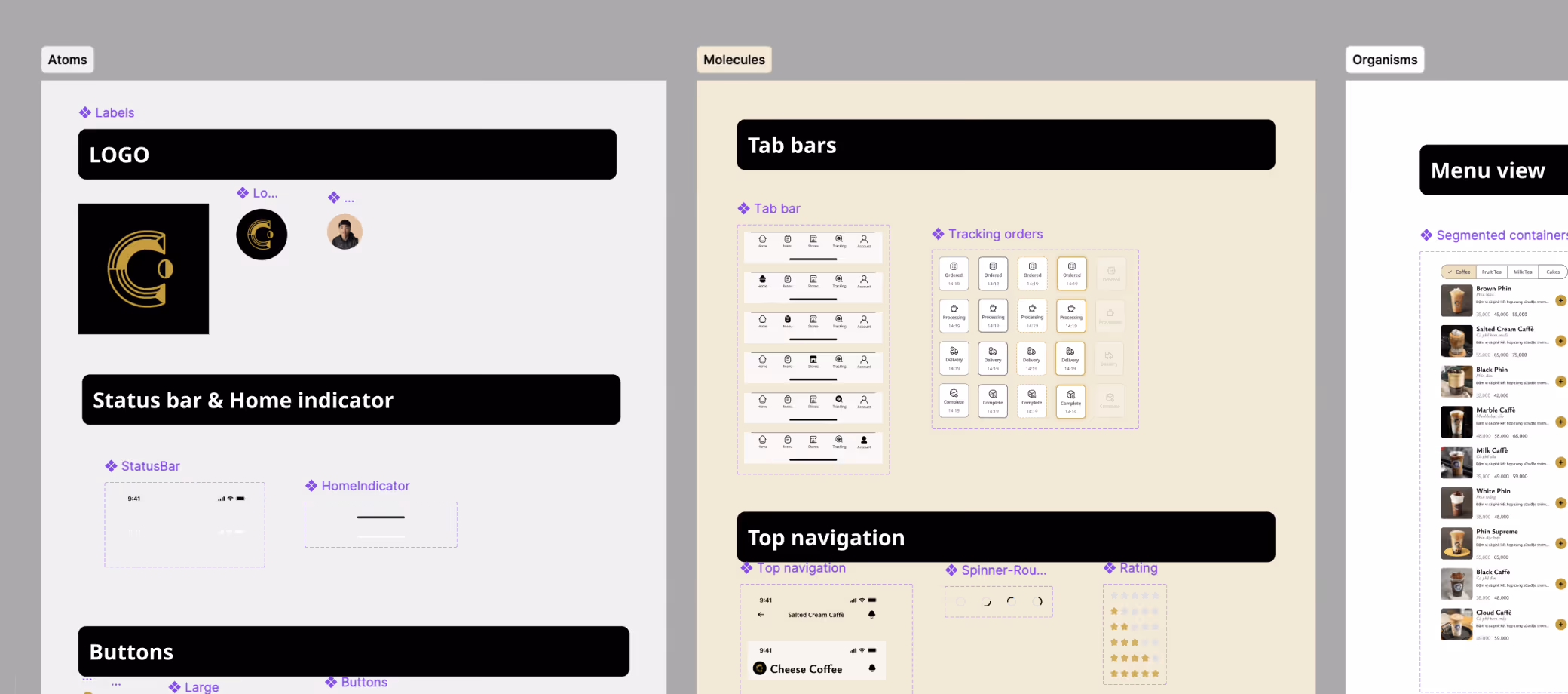
Atoms
Colour tokens, type scale, icons. It’s the indivisible units
Molecules
Buttons, inputs, tags, loyalty card
Organisms
Nav bar, menu rows, order cards
Templates
Full page layouts, content-independent
From 1 star to
a product worth using.
1 tap
to reach the membership code — down from navigating 3+ screens buried in settings.
4
new features shipped — unified ordering, loyalty, delivery tracking, menu view toggle
54%
usability improvement across all 6 original audit failure areas.
This was my first complete case study and it clarified something important: the most important design decision is what you choose to fix first. The UX failures weren’t random and they were symptoms of one root cause: no design system, no brand language, no navigation logic.
If I continued: usability testing with Gen Z users, integration with the real ordering backend, and a SaaS dashboard for loyalty campaign management.