A platform for users
with mobile money.
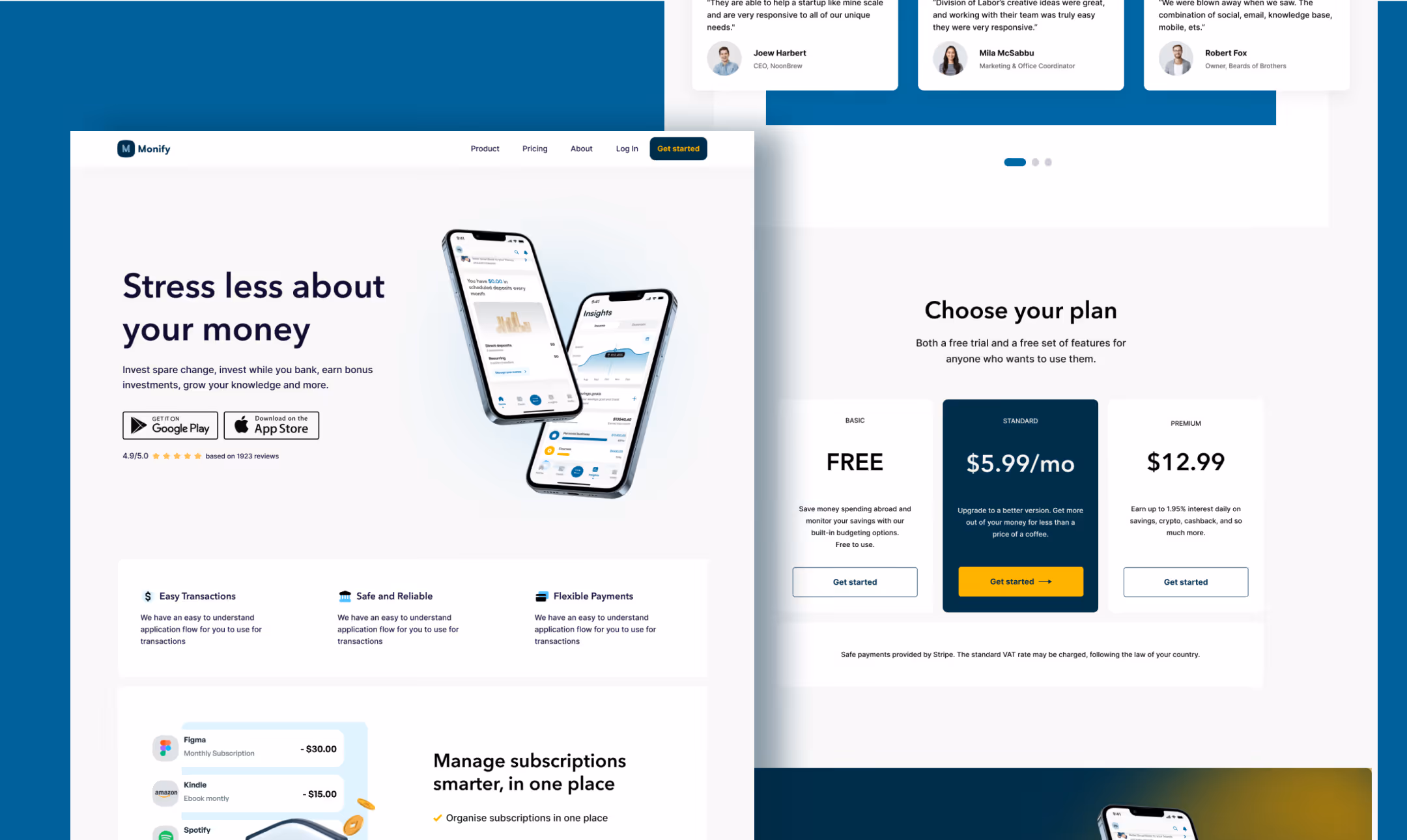
Monify was conceptualised as a multi-currency finance platform for globally active users who manage accounts across countries, currencies, and financial systems simultaneously.
Designing for finance means holding three things in tension: security, usability, and scalability. My role: UX and UI design, design system architecture, and scoping which features made the first release.
Lean UX: ship the core,
learn from the rest.
A fintech MVP is a bet — you're shipping with incomplete information. Lean UX was deliberate: deliver core value early, then learn from real users before adding complexity. The failed attempts above aren't separate from this process — they are the process.
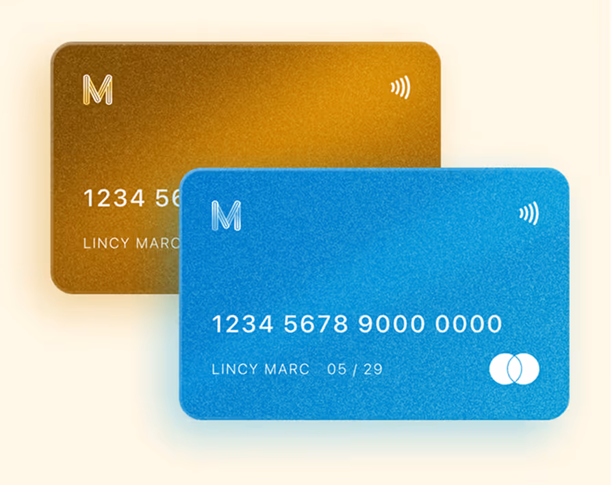
Core MVP only: layered dashboard, inline toggle, virtual card. Nothing without a validated reason.
→Task completion, drop-off by screen, time-on-task. Where do users hesitate?
→Synthesise signals. What creates clarity? What creates friction? What was wrong?
→Iterate on evidence. New features after the core is validated, complexity is earned.
Six features. Every one
earned its place.
Each feature was evaluated: does it serve a validated user need? Does it contribute to the core value? Can it be built to a high standard within scope? Anything that didn't pass all three went to the roadmap not the MVP.
What I Learned
The most valuable part wasn't the final design — it was being wrong three times in ways that each clarified something different. The full-overview failure taught information hierarchy.
If I continued: usability testing across all three surfaces, a second pass on the error state system with real error data.
What I’d do next